
For over 90 years the dot has been in nearly continuous use as a symbol representing ArtCenter, with only two exceptions: the period immediately following World War II, when the dot—particularly when it appeared in red—may have had too close an association with the Japanese flag, and for several years in the late 1980s, when the dot was put on sabbatical and then quickly reinstated after an outcry from the ArtCenter community.
The form reflects the College founders’ interest in contemporary international design and the influence of the Bauhaus, but symbolically it also resonates with our Southern California location (in orange: sun, citrus, etc.) as well as the “here” that the word center alludes to.
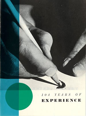
Orange has had an association with ArtCenter since its inception in 1930, when the front door of the school had a border of red-orange and, in the front window, the name of the school was accompanied by a matching red-orange dot. The choice of red-orange has been attributed to founder Edward A. “Tink” Adams’ affinity for the color, perhaps due to his love for Asian art.
After ArtCenter moved from its original location there was no single color identified with the College for a period of time, but orange made an official reappearance in the mid-1960s, when former president Don Kubly reintroduced it at the beginning of his leadership in reference to the College’s formative years. Orange has been strongly associated with ArtCenter ever since, though the exact shade of orange has varied over time from the original, nearly red hue, to a less red Pantone 1655 by 2000, to the relatively yellow Pantone 021.
ArtCenter was founded in 1930 as The Art Center School, and the name was changed to Art Center College of Design in 1965 to clarify its identity as a professional, degree-granting institution with an academic focus on both art and design. Almost from the beginning, though, it has been known informally as “Art Center.” This short-form name was given a new level of legitimacy in 1986, when Kit Hinrichs’ (BFA 63) ArtCenter logotype was introduced, though after several years the words “College of Design” were added to the official logotype. Beginning in the late 1990s the abbreviation “ACCD” also came into fairly regular use for a period of time.

Many different typefaces have been used in ArtCenter’s promotional materials through the years, but until 1965, when the College began a long institutional relationship with Helvetica, no one typeface could be said to have been a part of ArtCenter’s graphic identity. Helvetica was virtually the only typeface used in ArtCenter’s promotional materials from 1965 through 1986, and it was further institutionalized in the mid-1970s when it was chosen for the sign program at the College’s new Hillside Campus, parts of which are still in use today.


With the introduction of Hinrichs’ ArtCenter logotype, Futura became the ArtCenter identity’s typeface, but for much of the 1990s and until 2005 Futura’s role in the College’s overall public presentation was overshadowed by several design vocabularies developed for promotional materials by lead designers in the ArtCenter Design Office. The most notable among these featured the typeface Cholla, which was commissioned for ArtCenter by Denise Gonzales Crisp (BFA 82) and was used almost exclusively in all ArtCenter materials from 1998–2001, in essence becoming the de facto College identity during that time.

In 2006 a graphic identity designed by Takaaki Matsumoto (BFA 80) was introduced, and use of Univers was encouraged in promotional materials.

Throughout most of the history of ArtCenter’s identity there was no specific typographic wordmark. Remarkably, the 1986 Hinrichs logotype was the first. In the 1990s the words “College of Design” were appended to Hinrichs’ original design.

The lockup of dot and wordmark is an even more recent development. From the 1930s until 2006, when Takaaki Matsumoto’s logotype was introduced, the dot and the College’s name functioned separately. Matsumoto’s identity was retired in 2015.
Things that have been associated with ArtCenter since its founding in 1930: