ArtCenter
Identity
Guidelines
The Liberated Dot
ArtCenter Liberated Dot

The primary element of the identity is the dot, a symbol that has been used to represent ArtCenter since 1930. It should have a prominent presence in most communications that represent ArtCenter. We encourage use of the dot in unexpected and playful ways, but it can also be used as a kind of symbolic signature or “last word.” The dot should appear in orange whenever possible, especially when it stands on its own away from the name ArtCenter. The dot should not be used as a bullet point or for other functional typographic purposes, as this may diminish its presence as the College’s symbol. In the hierarchy of identity elements the dot should always be at least as prominent as any of the other components.

Versions of the dot optimized for various uses may be downloaded here.

The Right Orange

The color orange has had a long association with ArtCenter. The dot should appear in orange when possible. Orange can be used in other ways to represent ArtCenter, but overuse of orange should be avoided because it could diminish the presence of the dot.

PMS 172
0C 84M 100Y 0K
252R 70G 0B
#FC4600

Color values: Pantone: 172 / CMYK: 0C 84M 100Y 0K / RGB: 252R 70G 0B / Hex: #FC4600

A More Specific Name

The name of the college is written “ArtCenter” or “ArtCenter College of Design” with a capital “A” and “C” and no space between Art and Center, in running text as well as when the name stands alone. This construction helps distinguish ArtCenter from other “art centers.” Whenever possible, the short form of the name, ArtCenter, should be used. If the communication is intended for an audience that’s completely unfamiliar with ArtCenter, the full name “ArtCenter College of Design” should also be included somewhere in accompanying text.

We discourage use of the acronym ACCD. It should be limited to informal, internal communications if it is used at all.

We refer to the optimized versions of the College’s long and short names as our wordmarks. Wordmarks for various uses may be downloaded here.

Naming Lockups
A Strong Typographic Voice

The main typeface of the identity is Neue Haas Grotesk, a revival of the original 1957 design for Helvetica. The medium weight is used for the College’s name in the graphic identity, but use of the entire type family is encouraged. There are two versions of Haas Grotesk, Display and Text, that are intended for use at particular sizes. It is important that Haas Grotesk Display never be used at sizes under 14 point, and Haas Grotesk Text should never be used at sizes larger than 14 point. Relatively tight letterspacing is part of the design of Haas Grotesk, so additional tracking should only be used when absolutely necessary, and if so as little as possible should be added. In certain situations when Haas Grotesk is not available (in email signatures, for instance) it’s permissible to substitute Helvetica or Arial.

While Haas Grotesk is the official typographic voice of ArtCenter, it’s not the only typeface that can be used in our public materials. The typeface for a particular project should be determined by the subject or context, but Haas Grotesk should remain the default typographic choice and is recommended whenever the voice of the College is required.

Haas Grotesk includes distinctive alternate forms of the capital “R” and the lowercase “a.” We recommend the use of these alternate letterforms whenever possible. They can be found in the glyph palette or by applying OpenType stylistic sets 1 and 2.

The Neue Haas Grotesk type family and individual fonts may be purchased from Linotype.

Use of the Identity Elements

The combination of a prominent dot and the name ArtCenter or ArtCenter College of Design set in Neue Haas Grotesk Medium constitutes the graphic identity.

Although dot/wordmark lockups exist for certain purposes, ideally the dot and the College’s name will not appear as a lockup, but instead should function separately. The elements can and should be responsive to the context in which they’re used. There’s no preferred arrangement of the name—it can be a single line or stacked, flush left, flush right or centered as the need dictates. The examples below demonstrate a few of the many possibilities for placement of the identity elements.

We advocate a flexible approach to the College’s name and graphic identity that adapts to the communication needs of various audiences. We would recommend using the dot and the full name, “ArtCenter College of Design,” if the audience we’re trying to reach is completely unfamiliar with ArtCenter, but in other situations we can be more informal. We know that “ArtCenter” as a name is readily understood by audiences that already have a level of familiarity with the College—friends, partners, professional peers, donors, etc. And if the audience is very familiar with ArtCenter (for example, for communications on campus and/or to current students, faculty, staff, alumni and other “insiders”) the dot alone will be enough to convey the College’s identity.

We recommend that the shorter form of our name, ArtCenter, be emphasized over the long form whenever possible. “ArtCenter” can be used for an audience that’s unfamiliar with the College as long as the full name, “ArtCenter College of Design,” also appears somewhere in accompanying text.

The dot should be orange when it can be, because when it stands on its own the color becomes an important contributor to its meaning. If the dot is printed in a color other than orange it must be accompanied by the words “ArtCenter” or “ArtCenter College of Design.”

Alternate Typefaces

In addition to Haas Grotesk, a complementary serif font, Lyon, is recommended. Like Neue Haas Grotesk, Lyon is available in both Display and Text families that are optimized for use at large or small sizes.

The Lyon type family and individual fonts may be purchased from Commercial Type.

Lockups

While we recommend the dot and the name “ArtCenter” be used separately whenever possible, dot/name lockups exist for certain situations where logo files need to be distributed to outside organizations and publications.

Lockups of the dot and the College’s long and short wordmarks optimized for various uses may be downloaded here.

Departmental Lockups

We feel the best way to raise public awareness of ArtCenter is to communicate a cohesive identity through consistent use of graphic form and language. However, we also recognize the need of the various departments, offices and facilities that comprise ArtCenter to express their own individual identities. There’s a need to maximize both consistency and flexibility.

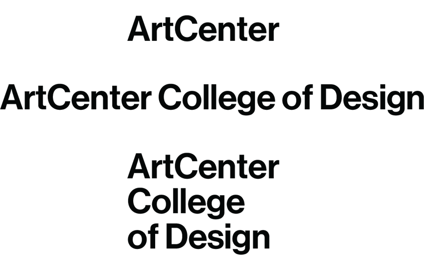
To address this need, we’ve developed a system for creating lockups for those departments and offices in need of a specific logotype that offers a visual presentation consistent with the ArtCenter graphic identity. We take the main elements of ArtCenter’s graphic identity—the orange dot and the typeface Neue Haas Grotesk Display Medium—and generate a set of flexible logotype lockups that are geared to the needs of specific audiences, from those who are completely unfamiliar with ArtCenter; to people who already know the College; to those who call ArtCenter home.

We don’t want to prescribe any particular design approach to a department’s print or online materials, or any specific color palette or typography; we’re only concerned with the logotype itself. We encourage freedom and flexibility. Any office or department’s materials can and should be as unique or subject-specific as they have always been (though in all instances ArtCenter or ArtCenter College of Design should be referenced in text to clarify the overall relationship between the office or department and the College).

Because consistent use of the graphic identity will help increase brand awareness we encourage all departments to take advantage of these lockups if possible, but we understand that they can’t address everyone’s needs. Some academic departments may have a compelling need for a different approach to graphic identity for their specific recruitment purposes, and because of this we consider this system optional for academic departments. The Design Office will work with any academic department that requires a non-standard graphic identity to optimize its presentation as part of ArtCenter’s overarching identity system.

We also understand that ArtCenter’s student and faculty organizations, public venues, initiatives and special events have unique audiences and may have very different communications requirements that don’t depend on primary identification with ArtCenter, so they should not be compelled to use this system if it doesn’t serve their needs.

Third, ArtCenter’s for-profit partnerships have a legal need to differentiate themselves from the College, and so this system is not intended for their use either.

But for the other departments, offices, facilities and initiatives that provide ArtCenter’s core services, these department-specific lockups offer a way to clearly establish their individual identities while also underscoring their essential relationship to the College as a whole.

If you’d like the Design Office to create a set of logotype lockups for your department or office, please contact us.

Color Palette

In addition to ArtCenter orange, we advocate the use of bright colors that suggest the sunny, vibrant and diverse culture of Los Angeles and Southern California. There is no specific palette; instead, color should respond to the needs of the content and context, but it can be as bright and bold as that context allows. Overuse of orange should be avoided because it could diminish the presence of the orange dot.

The iconic 1964 poster for The Endless Summer was created by alumnus John Van Hamersveld (BFA 64) while he was a student

Stationery System

ArtCenter stationery can be ordered through the Marketing and Communications Department. To place an order go here. Microsoft Word templates for use with the letterheads, envelopes and mailing labels can be downloaded here.

Email Signatures

An ArtCenter email signature format has been developed to help standardize the appearance of staff and faculty email. To ensure continuity in our communications the format follows the typographic conventions of the ArtCenter business card.

You can generate your own ArtCenter email signature here.