Patrick Hanenberger: Reimagining Santa Claus, the Tooth Fairy and the Easter Bunny
Degree:
BS 03 Transportation Design
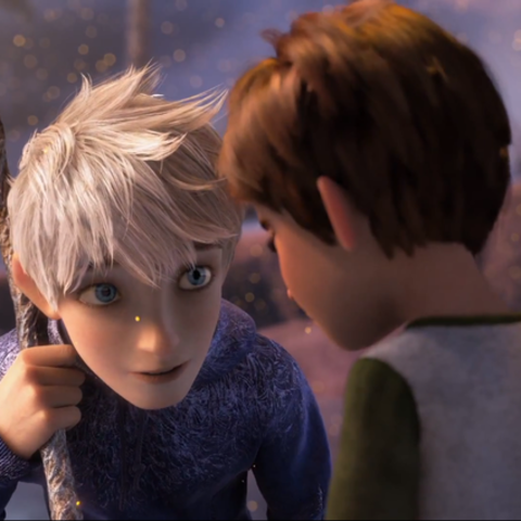
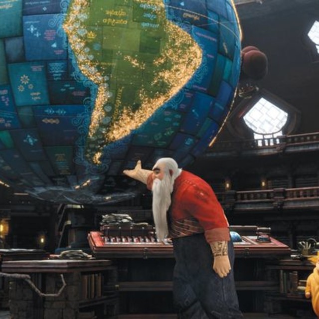
DreamWorks Animation’s Rise of the Guardians takes childhood fantasy figures like Santa Claus, the Tooth Fairy and the Easter Bunny and reimagines them as mythological heroes in an epic fantasy adventure. Directing the look and feel of the action-packed story is the film’s production designer, alumnus Patrick Hanenberger.
We recently caught up with Hanenberger, who graduated in 2003 with a degree in Transportation Design and is currently teaching a Visual Communication course. We chatted about his role in Guardians, how he ended up working in animation and which lessons from ArtCenter have stuck with him.
ArtCenter: First of all, how did you go from being a Transportation Design student to a production designer for animated films?
Patrick Hanenberger: I studied Transportation Design at ArtCenter and it taught me problem solving, 3D modeling, sculpting, sketching, designing around the human figure, rendering, research and most importantly presentation. These are all skills I use on a daily basis and are universal in any kind of design field. I always knew I wanted to work in movies and animated movies are great for designers since every single little detail needs to be designed and modeled. During ArtCenter I developed my portfolio to be very content based, which meant I always designed my vehicles for a specific story. After graduation I got a job as a visual development artist and from there on over the last eight years worked my way up to become production designer.
AC: What did your role as production designer on Rise of the Guardians entail?
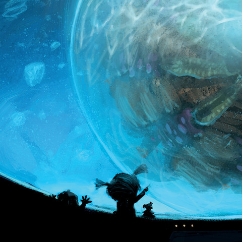
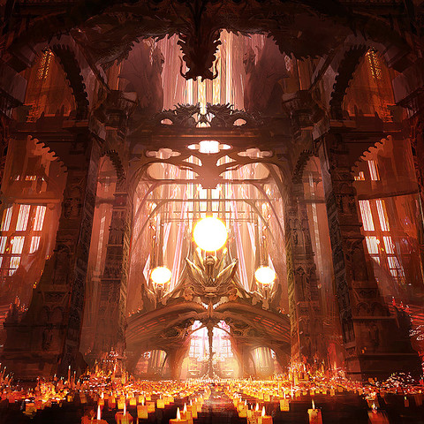
PH: As production designer you are in charge of the design of the movie. Along with many talented artists you design everything from characters to environments, costumes and color palettes. Basically you are in charge of the overall look and visual feel of the movie and work with almost every department to realize it along the way.
AC: What was your biggest challenge on Rise of the Guardians?
PH: The movie was incredibly complex and very ambitious. We wanted to create a Lord of the Rings meets Avatar for kids. Both of those inspirations are massively daunting. Re-designing the icons of childhood was also a very difficult task. We wanted these mythological characters to feel contemporary and meaningful—something kids today could relate to and understand; not idealized and romanticized.
AC: Are there any specific lessons or instructors that you constantly think back to while working on your projects?
PH: I still quote some of my most influential teachers all the time. The biggest thing I tried to infuse into our art department was the “learn to learn” attitude which Bob Kato hammered into my head when I was a student—never stay put, constantly challenge yourself and teach yourself to improve yourself. A big influence on me was also Frido Beisert and his work ethic.
AC: What do you teach in your Visual Communication 6 course?
PH: Karen Hofmann and I designed a new class which re-thinks the traditional Visual Communication class a bit. The class still teaches students how to most effectively present their work, but it does so in a more sequential way. Students are given time constraints for their presentations and have to do a different pitch every week, using a different technique (e.g. a simple animation, story board pitch or sizzle reel). The class is also entirely Web-based so students present their homework every week from their website.
AC: Any advice for prospective or current students interested in following in your footsteps?
PH: Work hard and be nice. Your skills are only 50 percent of the battle. You need to have excellent communication, problem solving and presentation skills. You also need to be able to take direction and adapt to ever changing work environments. You also need to be a pleasant person to be around since the world is a village and this industry is tiny.

